Email signatures are an important part of your professional communication. They can convey your brand identity, personality, and contact information to your recipients. But did you know that the color of your email signature can also have an impact on how your message is perceived?
In this blog post, we will explore the role of color in signatures and how to choose the best colors for your signature font, banner, footer, quotes, social media icons, and more. We will also share some examples of good and bad signature colors and how to avoid common mistakes.
Why Colors Matter in Email Signatures
Color is a powerful visual element that can influence our emotions, moods, and actions. According to color psychology, different colors can evoke different associations and meanings in our minds. For example, red can signify passion, urgency, or danger, while blue can suggest trust, calmness, or professionalism. Properly designed email signatures can provide you with a significant boost in lead generation.

Here is how colors in your email signature can impact your recipients:
Stand out from the crowd: A well-chosen color can make your email signature more eye-catching and memorable, especially if it matches your brand identity and logo.
Create a positive impression: A harmonious color scheme can make your email signature look more professional, elegant, and credible, while a clashing or dull color scheme can make it look amateurish, boring, or untrustworthy.
Communicate your message: A strategic use of color can highlight the most important information in your email signature, such as your name, title, or call to action. It can also convey your personality, tone, or mood to your recipients.
Reflect your brand identity: When aligned with the brand’s color scheme, your signature can enhance brand awareness and consistency. They can evoke certain emotions or associations tied to the brand, such as trust, creativity, or passion. Moreover, a well-chosen color palette can make the signature more visually appealing, leaving a lasting impression on the recipient.
What are the Best Email Signature Colors?

There is no one-size-fits-all answer to what colors you should use in your signature templates. Here is what factors you should keep in mind when choosing colors for your email signatures:
Your industry: Different industries may have different expectations and conventions for email signature colors. For example, if you work in a creative field, you may have more freedom to use bright or unusual colors than if you work in a conservative or formal field.
Your audience: Different audiences may have different preferences and reactions to email signature colors. For example, if you target a younger or more diverse audience, you may want to use more vibrant or trendy colors than if you target an older or more traditional audience.
Your brand: Your email signature should reflect your brand identity and values. You should use colors that are consistent with your logo, website, and other marketing materials. You should also use colors that match your brand personality and voice.

Tips and Best Practices for Signature Colors
To help you choose the best colors for your email signature, here are some general tips and best practices:
Use a color wheel: A color wheel is a tool that shows the relationship between different colors. You can use it to find colors that complement or contrast each other. For example, you can use complementary colors (opposite on the color wheel) to create contrast and attention, such as blue and orange. You can use analogous colors (next to each other on the color wheel) to create harmony and balance, such as green and yellow.
Use a color palette generator: A color palette generator is a tool that helps you create a set of colors that work well together. You can use it to find colors that match your brand logo or image. For example, you can use tools like Coolors or Adobe Color to generate color palettes based on an image or a hex code.
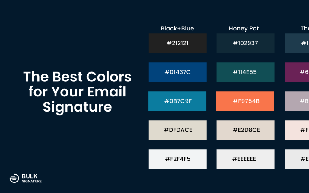
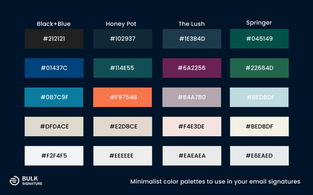
Use a limited number of colors: A good rule of thumb is to use no more than three colors in your signature. Too many colors can make your template look cluttered, confusing, or unprofessional. You should also avoid using too many shades or tints of the same color, as they can reduce the contrast and readability of your text.
Use dark colors for text and light colors for background: A common mistake is to use light-colored text on a light-colored background or dark-colored text on a dark-colored background. This can make your email signature hard to read and strain the eyes of your recipients. You should always use dark colors for text and light colors for background (or vice versa) to create enough contrast and visibility for your text.
Choosing Colors Based on Your Brand Identity
When choosing colors for your email signature, it’s crucial to ensure they align with your existing brand identity. Your brand colors play a significant role in shaping your company’s perception and recognition.
Here what you can do to identify your brand’s color palette:

Review your brand guidelines: If you have a formal brand style guide, refer to it for your company’s primary and secondary colors.
Analyze your website and marketing materials: Look for recurring colors in your logo, website, and other marketing assets.
Consider your industry and target audience: Certain colors may be more commonly associated with specific industries or demographics.
Using Complementary or Analogous Colors: Once you’ve identified your brand’s primary colors, you can choose complementary or analogous colors for your email signature.
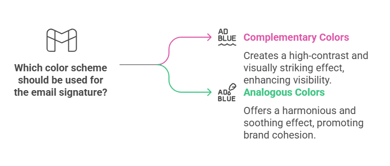
Complementary colors: These are colors that sit opposite each other on the color wheel, such as blue and orange or red and green. They create a high-contrast and visually striking effect.
Analogous colors: These are colors that are adjacent to each other on the color wheel, such as blue, green, and yellow. They create a harmonious and soothing effect.
Example: If your brand’s primary color is blue, you could choose orange as a complementary color for your email signature, or green and yellow for an analogous color scheme.
Psychology of Color in Email Signatures
Colors can evoke specific emotions and associations, making them a powerful tool for influencing your audience’s perception. Understanding the psychology of color can help you choose the right colors for your email signature.
Here are some examples of how different colors can impact your audience:
Blue: Often associated with trust, reliability, and professionalism.
Red: Can evoke feelings of excitement, passion, and urgency.
Yellow: Represents optimism, happiness, and creativity.
Green: Often associated with growth, nature, and harmony.
By carefully selecting colors that align with your brand’s message and the desired emotional response, you can create a more impactful and memorable email signature.
Examples of Good and Bad Email Signature Colors
To illustrate how color can affect your email signature, let’s look at some examples of good and bad signature colors.
Good Email Signature Colors
This signature example uses a simple but effective color scheme of black and white with a touch of light colors. The black text on a white background is easy to read and looks professional. The banner matches the contact details font color and adds some interest and contrast to the signature. The whole signature example also suggests trustworthiness and reliability.

Other possible email signatures may use a colorful but harmonious color scheme, but we still suggest sticking to the minimalist palettes presented above. You can also use the colors that are analogous to the color wheel and create a warm and cheerful impression. If you don’t have much of an established brand identity with the precise set of branded colors, you can also rely on the colors of your logo. This way you’ll make sure you reflect professionalism and credibility.
You should also note that a good email signature should be optimized for dark mode, which requires additional manipulations with your email signature colors. Depending on the platform, the colors of the elements might be inverted and look completely different from what you originally created.
Bad Email Signature Colors
This email signature uses a clashing and distracting color scheme of black, green, and blue. The colors are complementary on the color wheel, but they are too bright and saturated for an email signature. The colors also do not match the logo of the sender, creating a mismatched and unprofessional impression. Contact details icons are black, while the social media buttons are green.

Apart from that, in some cases, the use dull and boring blank color scheme of pale grey and beige for email signature might have a negative impact. These colors are too similar and lack contrast and interest. The colors also do not convey any personality or message to the recipients, making the signature template forgettable and bland.
How to Apply Colors to Your Email Signature Elements
Now that you have an idea of how to choose the best colors for your signature, let’s see how to apply them to the elements of your template. Here are some tips and examples for each element:
Signature font color: Your signature font color should be dark enough to stand out from your background color and light enough to contrast with your banner color. You can use your brand color or a neutral color like black, gray, or navy for your signature font color. For example, your email signature may use a dark gray font color that matches the logo and contrasts with the white background and the blue banner.
Signature color: Your signature color is the color of your name or your handwritten signature. A good signature can have different colors, but you still shouldn’t overuse too many colors in one signature. Try to stick to 2-3 colors from the core color palette. You can use your brand color or a complementary color for your name, job title, department, or even the company name to make them look prominent and personal. For example, you may use a purple color for your job title to make it match with your logo.
Banner color: Your banner color is the color of the horizontal bar that separates your contact information from your email body. You can use a bright or contrasting color for your banner color to create some visual interest and attention. You can use your brand color or a complementary color for your banner color. If you want to make your call-to-action stand out, we suggest creating an animated banner for your signature.
Email footer color: Your email footer color is the color of the horizontal bar that separates your email signature from your disclaimer or legal information. You can use a subtle or neutral color for your email footer color to create some visual separation and hierarchy. You can use your brand background color or a slightly darker or lighter shade for your email footer color.
Email signature quotes: Your email signature quotes are optional elements that you can add to your email signature to share some wisdom, inspiration, or humor with your recipients. You can use a different font style or size for your email signature quotes to make them stand out from your contact information. You can also use a different font color for your email signature quotes to make them more noticeable and memorable. You can use your brand color or a complementary color for your email signature quotes.
Conclusion
Color plays a significant role in the effectiveness of email signatures. The right color choices can make your signature stand out, create a positive impression, and communicate a message effectively. However, it’s important to consider factors such as industry, audience, and brand when choosing colors. Tools like a color wheel and a color palette generator can be helpful in creating a harmonious and professional color scheme. Lastly, the application of color to various elements of your template needs to be done thoughtfully, as shown in the examples of good and bad email signature colors. Therefore, understanding and applying color theory in email signatures is crucial for enhancing communication and perception.