In the world of constant technological development, people tend to rely more on mobile devices. The features that smartphones provide today are mindblowing. Something that was not a common thing in the past, today is becoming a standard. The technological advancements affect our communication and require us to adjust to them. In the past it was hard to imagine, that we would be able to check our inboxes without even leaving our beds. Today it’s become our routine.
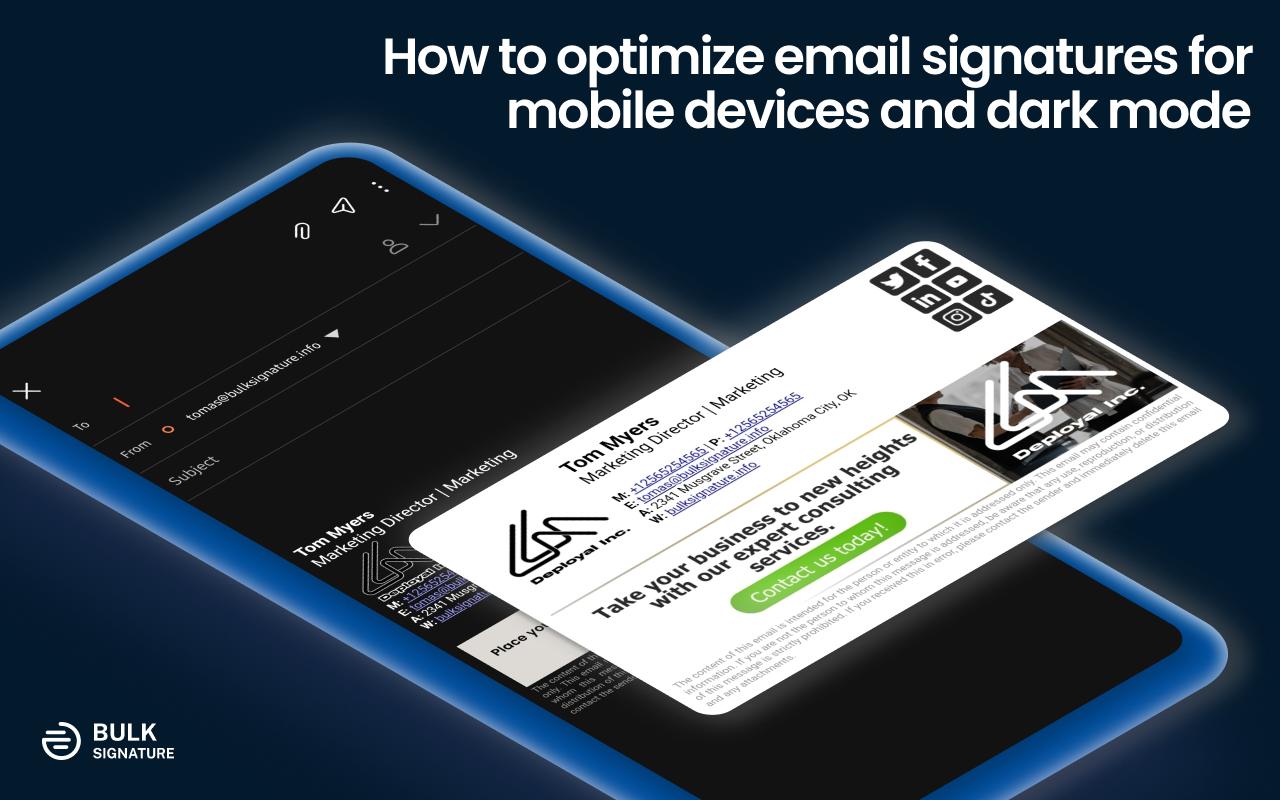
In this article we will share everything you need to know about email signatures for mobile devices and how you can properly optimize them for your needs. You can learn how mobile and desktop email platforms interact with email signatures, how to add email signatures to your mobile email platform, and what you can do to make them look stunning on all platforms.
Email platforms: Mobile vs Desktop
You might’ve noticed that with the constant development of applications, the difference between mobile and desktop is becoming less apparent. Therefore, we end up defying the aspects that we actually should keep in mind. The aspects that affect our email signatures and eventually damage our brand.
Screen Size
The most noticeable difference is the screen size of your device. The factor of your screen size affects the viewport, which refers to the visible area of a web page/application/document/etc.
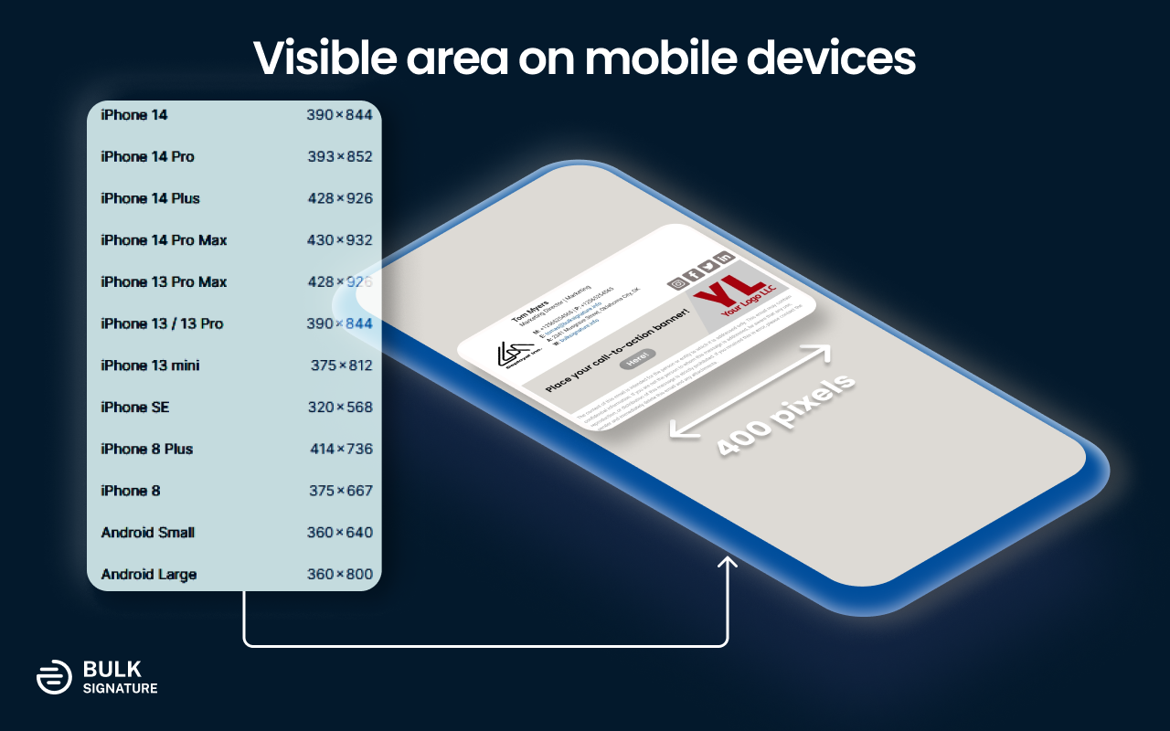
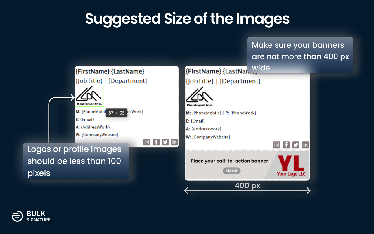
You should be aware of this condition to design a perfect email signature for mobile devices. For this reason, wide email signatures turn out to be inefficient. The golden rule is to keep your email signatures less than 400 pixels wide.
The ultimate solution might be to use vertical or boxy email signatures. Email signatures of this sort of work perfectly fine for both desktop and mobile platforms.
Different platforms - different implementation
In the article about dark mode email signatures, we have already talked about the factor of a platform that significantly affects the end result, Different applications have their own hidden ways of email signature depiction.
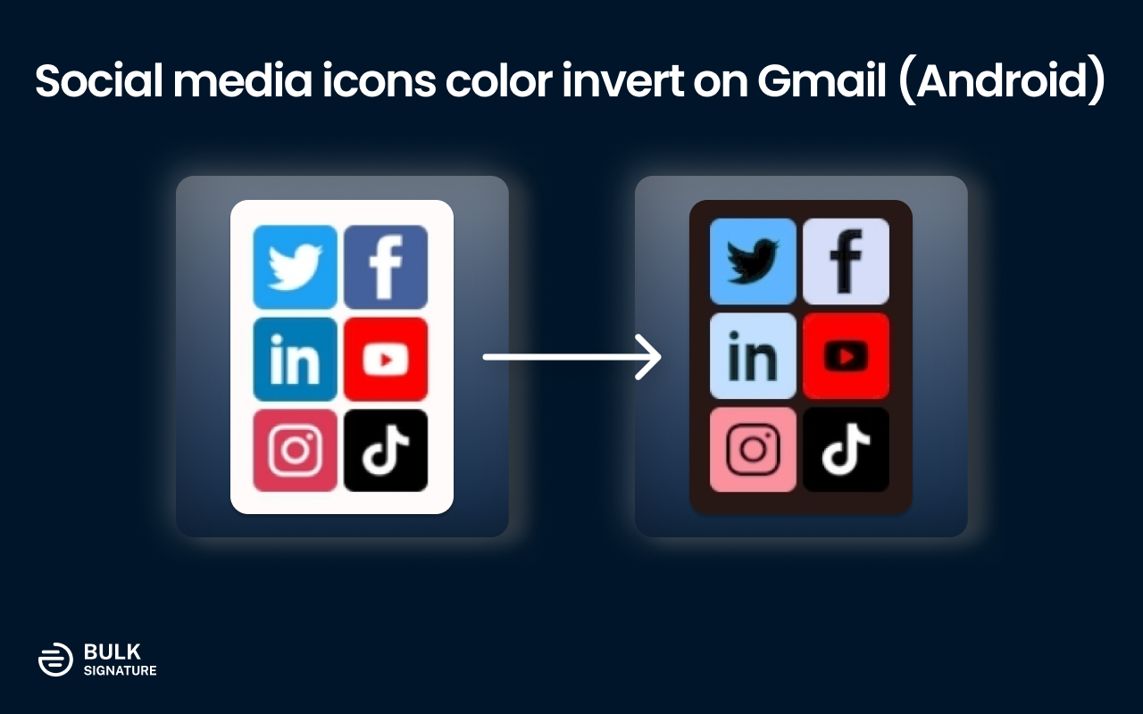
In some cases, the core functions can vary significantly even within a single platform. For example, the official Gmail application for mobile devices inverts the colors of the key elements of an email signature in a strange way when dark mode is enabled. As a result, your email signatures end up looking completely different from how they were originally designed.
The only possible solution to this sort of issue turns out to be testing on various platforms. This is the only way that will help you to accomplish the perfection of your email signatures.
Why my email signature doesn’t show on the Gmail Android app and what to do about it?
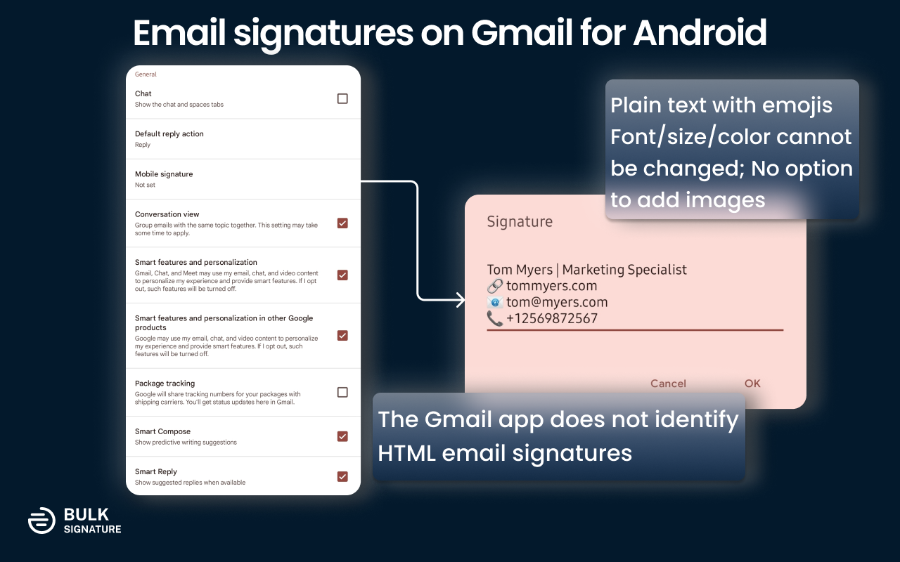
Limitations on mobile devices come not only in terms of how email signatures appear but also if they work at all. For instance, email signatures that you have installed in your Gmail settings do not work on the Gmail mobile app for Android. Even though there is a section called email signatures in your settings you cannot paste in your HTML since it will automatically be converted to plain text.
Ironically, the feature functions on the Gmail application for iOS without any problems. You simply need to turn off the mobile signature in your settings. Although you won’t be able to see your email signature in the compose pane, it will still be applied to your emails automatically on the server side.
When it comes to Android there is a solution, if you’re a Samsung user. Instead of using a standard Gmail application, you can get the Samsung Mail app that supports HTML email signatures. Simply by copying your email signature, you will be able to paste it to your Samsung Mail Settings. However, there is an abovementioned condition that you need to follow for better visibility — your email signatures should be less than 400 pixels wide.
For non-Samsung users, the only way to get email signatures is by installing Spark. You must understand however that the email signature installation is more painful since it requires you to insert the HTML code. You cannot simply copy and paste your email signatures into the settings.
Designing mobile-friendly email signatures
Optimize images in your email signature
Make sure your images are appropriately optimized. Do not use images for logos or personal photos larger than 100×100 dimensions, they might get squished by some of the mobile platforms.
Keep in mind that most of the users tend to use their devices in dark mode. Do not forget to optimize all the transparent objects before deploying your email signatures.
When it comes to call-to-action banners you need to keep in mind the original width of your email signatures, which is supposed to be under 400 px. Stick to 400px so that your banner doesn’t affect the overall width of your email signature.
Be picky with the templates you use (include the info about the layout)
The main problem that you have to deal with in the process of designing email signatures is related to the display size of mobile devices. Most of the templates that you can find online are horizontal, which, for obvious reasons, are more suitable for desktop view.
When it comes to designing email signatures for all platforms including mobile applications it is much better to go with vertical options. However, you need to make sure it’s not too tall since you shouldn’t expect your recipients to scroll all the way down to find the specific information.
On the other hand, you can still optimize horizontal email signatures for the mobile view. The first step you need to do is to consider minimizing the unused space. For a concise illustration of contact details, consider using emojis (📞📱☎️📧📨📬🏢🏨), short tags (M., E., etc), or icons. Try playing with the overall layout by repositioning the elements in your email signature.
Review the contact details in your email signature (anchor text, Google Maps, etc.)
Instead of simply inserting your company addresss to your email signature you can turn it into an interactive element that will help your recipients immediately get the access to the exact location of your company. To do that, you need to get the link to your address from a navigation platform such Google Maps, Apple Maps, or any other ones. Further, you need to add the link to the HTML code of your email signature into the href property of the <a> element.
Another thing to do is to replace the link to your website, with an anchor text that says, “Visit our website”, “Learn more on our website” or simply “Our website”. For better visibility you can add an emoji (🌐🌏🌎🌍🔗). You can do the same thing to your email address.
Consider adding space between elements for better mobile accessibility
Even though we’ve already stated that you need to get rid of unnecessary spacing in your email signature, you should still keep some elements separated. You don’t want your users to struggle with clicking on the appropriate link or social media icon. The rule is pretty simple and straightforward, the larger the elements, the less space should be between them. Why? Because if the element is big enough, it will be easier for your recipients to interact with it.
Font size and color
Choosing the appropriate font size and color is one of the most complicated points of your email signature design process. The problem lies in the fact of making the elements visible, accessible, and not too large.
In most cases, the largest font you can use is about 18 px. It suggested using it for the points you would like to highlight, such as your name, job title, and department or company name.
When it comes to contact details you can stick to a smaller font which is about 12-14 px. Bear in mind the spacing between the points so that they are accessible for mobile users and easier to interact.
Testing
The final part is about testing your email signatures on different platforms. You need try it on different platforms and check if it appears exactly as you intended it, before applying it to every user in your organization. The best way to do that is to use email signature management tool such as BulkSignature that will help you to design any email signature and allows you to make as many changes as you need.
