Finding perfect email signature fonts is the key factor for the efficiency of your email signature. However, in the process of designing an email signature, you are limited in terms of available options.
In this article, we are trying to explain what seems to be the problem when it comes to font options in your email signatures, what best email signature fonts you can select, and how to optimize them.
Why Font Selection Matters
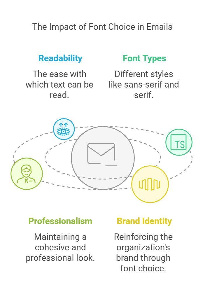
When recipients open an email, their eyes naturally gravitate toward the content. The font you choose significantly affects how easy it is for them to read your message. Some fonts are inherently more readable than others. Sans-serif fonts (like Arial or Helvetica) tend to be cleaner and easier on the eyes, especially on screens. Serif fonts (like Times New Roman) can work well for printed materials but may not be ideal for email signatures due to their intricate details. Using a consistent font across your organization’s email signatures creates a professional and cohesive look. It reinforces your brand identity and ensures that recipients recognize your communications instantly.
Web fonts vs. Safe fonts
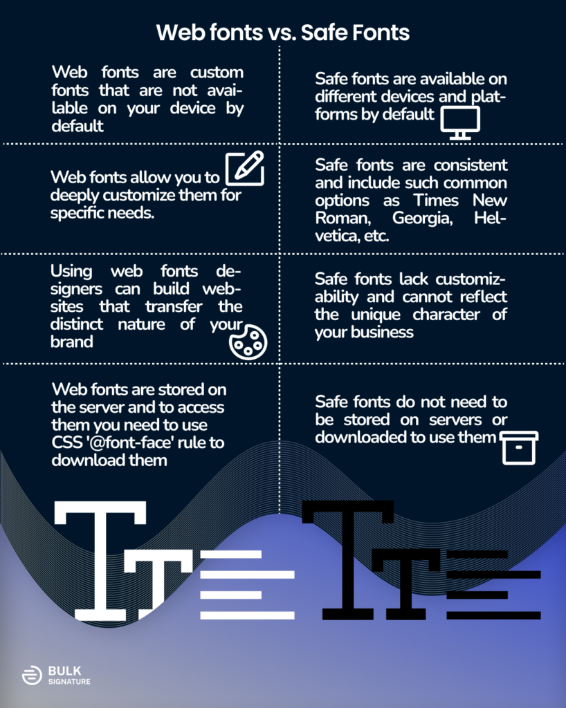
In order to understand the root of the problem we need to point out the difference between web fonts and safe fonts (also known as Desktop Fonts). Both of them refer to different ways of font display on websites, devices, documents, etc. Let’s have a closer look at each point separately.
What are web fonts?
To put it short, web fonts are custom fonts that are not available on your device by default. One of the main advantages of web fonts is that they allow you to deeply customize them for specific needs. Using web fonts designers can build websites that reflect the distinct nature of your brand.
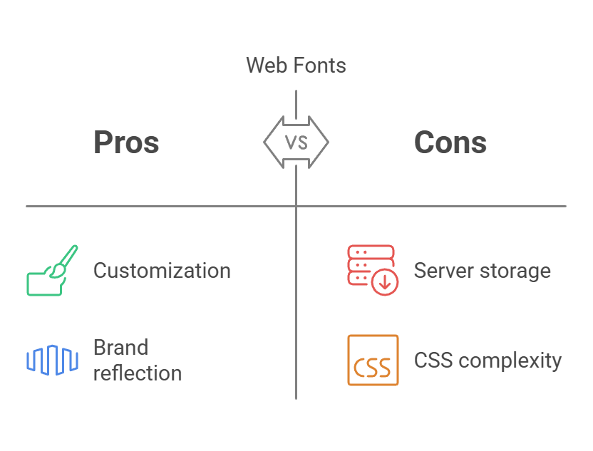
However, as with every good thing in the world, web fonts have their own drawbacks. They are stored on the server and to access them you need to use CSS ‘@font-face’ rule. This way it downloads the web font from the server and uses it on the web page.
Even though the best-known provider of web fonts is Google Fonts, there are also such services as Typekit and Adobe Fonts.
What are safe (desktop) fonts?
Safe fonts or desktop fonts, on the other hand, are the opposite of web fonts. Safe fonts are at the disposal of most devices by default. Safe fonts, which are also referred to as system fonts, include such common options as Times New Roman, Georgia, Arial, Tahoma, etc.
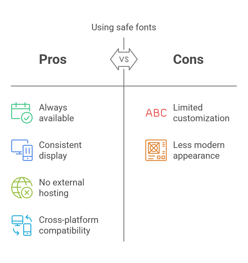
Although safe fonts do not get the appreciation that they deserve, they have huge advantages in comparison with customizable web fonts. One of the benefits of web fonts is their cross-platform compatibility. Irrespective of the device the standard system fonts will be displayed properly without any constraints.
There is no need of hosting them on servers and loading them from external sources – they are always available and consistent throughout all platforms and devices.
Key Difference between Safe fonts and Web fonts
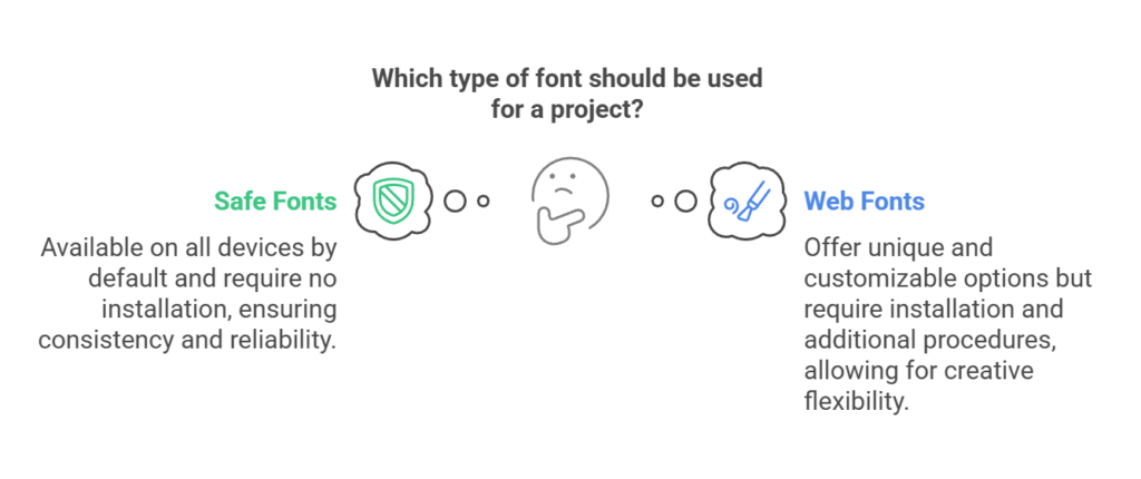
Summing it up, the difference between the two is that
- safe fonts are available on any device by default
- safe fonts don’t require additional installation steps
- web fonts need to be installed
- web fonts provide unusual broadly customizable fonts
- web fonts can be used only after the set of necessary procedures.
Why you can’t use web fonts (like Google Fonts) in your email signatures
When it comes to email signature design, most of the available email signature editors cannot provide their users with diverse email signature font options. Instead, there are only several fonts that at first sight may seem boring, The users end up having a question about why they cannot enjoy all the possible customization options that are currently available in web design and email marketing. On top of that, @font-face rule has become a standard that is supported by almost all browsers. However, it’s not the case when it comes to email signatures.
The problem is about how fonts affect email signatures and our overall ability to control their HTML code. You might be asking yourself a reasonable question — What about email marketing newsletters that look like web pages? But attaching email signatures at the end of your emails is not the same thing as using services like Ominsend, Mailchimp, etc.
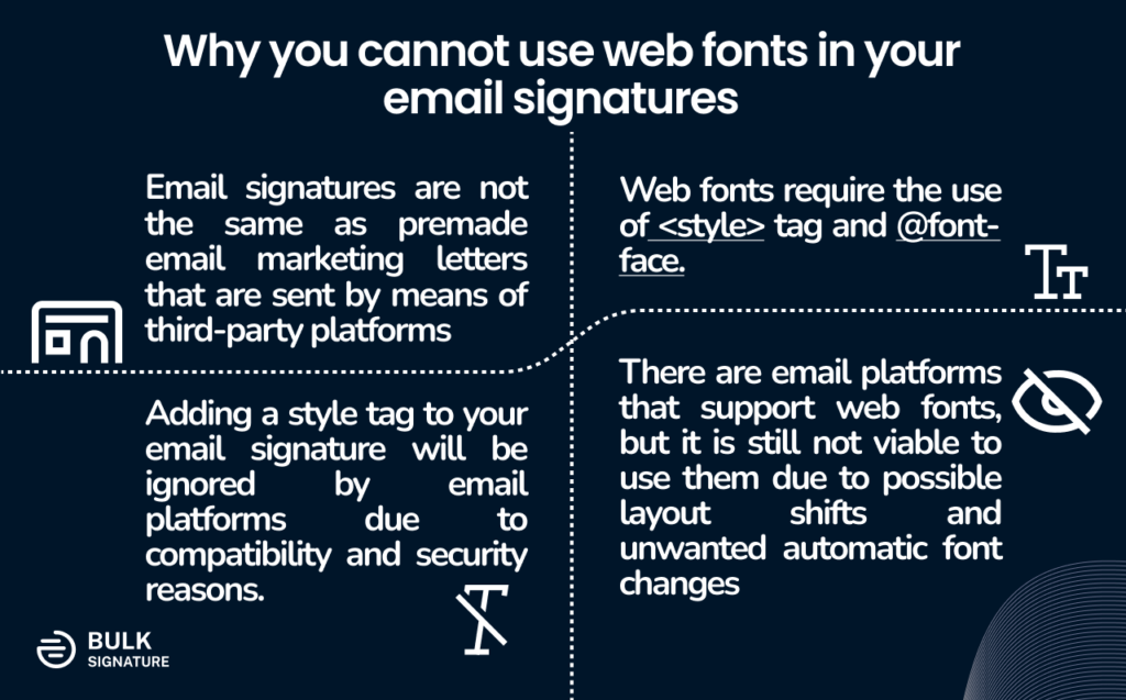
The key issue is that web fonts require the use of a <style> tag and @font-face. The approach functions when used from bulk email services. Having an email signature attached at the end of your email is a totally different story. Adding a style tag to your email signature won’t make a difference since email platforms ignore them, i.e. the head of the HTML email signature will be automatically removed. Email platforms have their own hidden ways of processing your HTML email signatures. But why? Mostly due to security and compatibility reasons so that they could work in accordance with email platforms.
Even though there are platforms that support web fonts, it is still recommended to refrain from using them in your email signatures. Your customized email signatures may end up looking different when viewed from platforms or devices that do not have exact web fonts installed. The system will replace your web font with a safe fallback font, which may cause layout issues.
How to make web fonts work in your email signatures
The use of web fonts is possible when email signatures are applied through email signature management applications or custom processes performed by your IT. This way the customized HTML is installed to your email settings without any changes. However, the desired result will only be visible on the limited number of email platforms that support web fonts.
If you believe that this way works for you, it’s important to take care of fallback fonts that will be used instead of web fonts on incompatible devices or platforms. Just keep in mind that the formatting cannot be specified for these cases and it will affect the overall view. Here’s why using default safe fonts is still more consistent and reliable. However, here is how you can set up fallback fonts:
- You need to open the source code of your email signature
- Find the specific paragraph that you would like to adjust
As you can see using safe fonts is still less painful, more consistent, and reliable. If you still insist on using web fonts for your brand reflection in your email signature but wouldn’t like to spend time working on all of these procedures. We suggest that you select the closest safe font to its web option. At the same time, for some parts of your email signature, such as your company name, website, or address, you can use transparent images that use your preferred web font.
The Solution: Make Use of Safe Fonts for your Email Signatures
After going through all the information above, it’s becoming more and more obvious that there is no better solution than safe fonts for your email signatures. Due to a number of reasons, the fonts that you can use are quite limited.
The goal here is to find the best siganture font that is compatible with as many devices and platforms as possible. At the same time, it should be closely connected to your brand. Most of the time brand guidelines provide safe fonts or document fonts that you can use for your email signatures.
What are the Best Signature Fonts?
You can divide most safe fonts into serif fonts and sans-serif fonts. In this section, we’ll try to compare the two to help you find the option that works best for your business.
Serif fonts vs. Sans-Serif fonts: Which one works best for your brand and email signatures
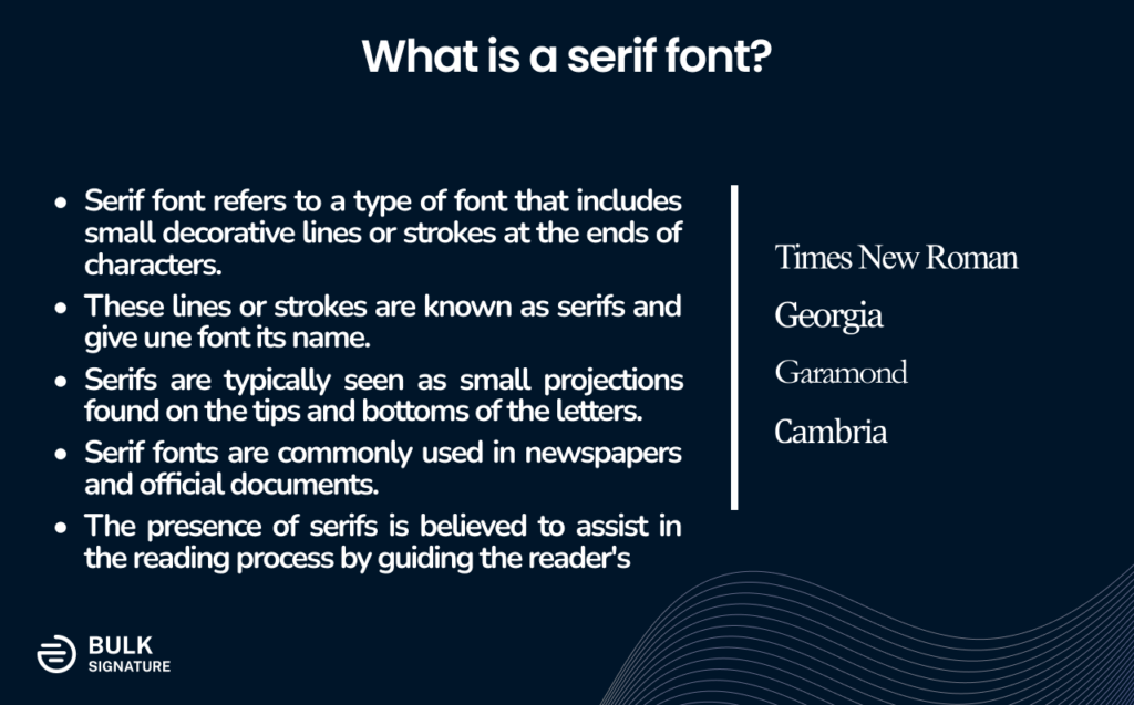
Serif font is a type of font that has tiny decorative lines or strokes at the ends of the characters. The lines or strokes are called serifs, that’s where the font type got its name. These serifs can be seen as small projections on the tips and bottoms of the letters. You can mostly find serif fonts in newspapers and official documents since serifs are believed to be helpful for the reading process by guiding your eyes.
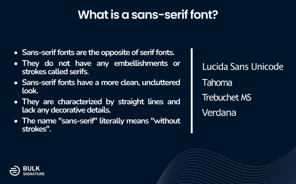
Sans-serif font is the exact opposite. The fonts of this type do not have any of the serif’s embellishments and tend to have more of an uncluttered look. Straight lines without any distractions. This font type is called ‘sans-serif’ which means ‘without strokes’.
When it comes to what these types represent, Serif fonts are often perceived as more traditional and formal. The font type is normally used in printed materials such as books, newspapers, and documents. The most common serif fonts are Times New Roman, Georgia, and Garamond. This font type is mainly used by law firms, educational institutions, financial organizations, etc.
At the same time, sans-serif fonts are perceived as modern, straightforward, and minimalist. The font type is mainly used by different tech and software companies, car companies, beauty brands, fashion, and almost everything else.
The best fonts for email signatures
Choosing the best font for email signature is an uneasy task. Especially when it turns out that you are limited to safe fonts only. However, even when the choice is limited there are always perfect options that will work for your business needs. The most consistent option is to use the standard email font that your company relies on. This way you’ll make sure your signature font is aligned with the content of your emails. The best email fonts on Gmail include Sans Serif (Arial), Serif (Times New Roman), Georgia, Tahoma, and Verdana. Choosing one of these for your signature blocks will allow you to achieve the consistent experience for your recipients.
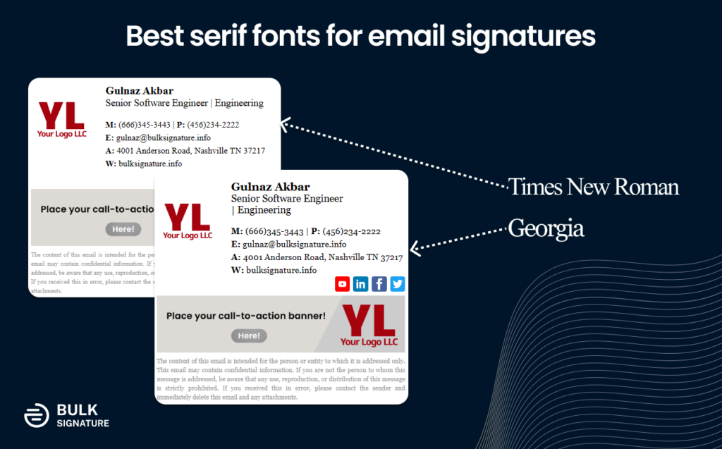
We’ve created a list of top email signature fonts for your business:
- Roboto
- Verdana
- Tahoma
- Georgia
- Trebuchet MS
- Garamond
- Courier
- Palatino
- Cambria
- Geneva
- Helvetica
- Times New Roman
- Arial
What font size should your email signature be?
The most optimal font size for your email signature is somewhere between 10 to 12 pt. This way your signature won’t be too large to take away the attention from the actual message of the email. At the same time, it’s going to be readable enough for your recipient to easily understand the information you’ve included.
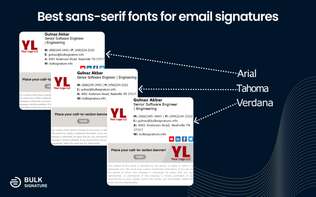
What is the best font color for email signature?
Just like with fonts and their size, email signature color also matters. While some colors may look like a good idea at first, it’s always better to keep your email signature neat and professional-looking. To achieve this, stick to neutral colors. For example, black, gray, and blue are considered the best font colors for email signature. They ensure that your signature is readable, formal, and aligned with business etiquette.
If you want to make your email signature stand out without using anything fancy, a good idea would be to try bolding the font or using larger font size for your name. This will help you create a hierarchy of information and let your recipient focus on what really matters.
Now that you know everything about the best font for email signature, it’s time to choose the one that works for your company and your brand. Just remember to keep your email signature font readable, formal, and universal.


