
A professional email signature does three jobs: it tells the reader who you are, gives them a way to reach you, and makes the company look like it has its act together. Most signatures fail at the third one. Too many lines, a 2 MB logo, four social icons, a motivational quote, and the phone number pushed below the fold on mobile.
This guide shows ten real signature examples and what makes each one work, then walks through what to include, the specs that keep a signature rendering cleanly, and how to set one up in Gmail or Outlook.
Quick Answer: A professional email signature contains your full name, job title, company, one or two contact methods, and a logo or headshot, in four to six lines. Keep images under 100 KB and 320 px wide so the signature renders on mobile, use one brand color, and skip quotes and more than three social icons. Below are ten example layouts, from plain text to a full signature with a banner, and the rules for choosing between them.
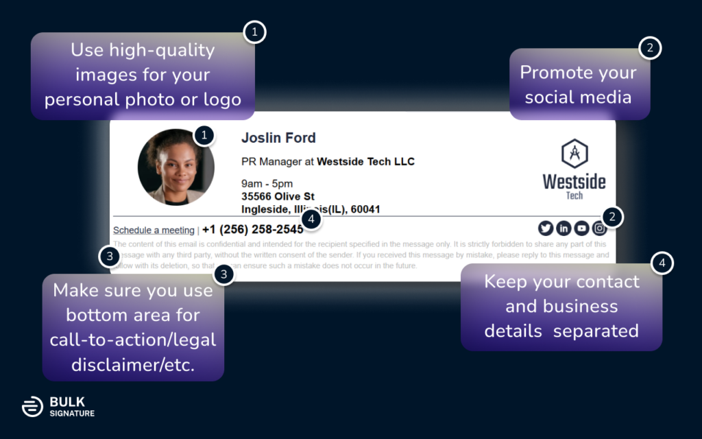
What to include in a professional email signature
| Must have | Worth adding | Leave out |
|---|---|---|
| Full name | Headshot (client-facing roles) | Personal quotes or mottos |
| Job title | Company logo | Home address or personal phone |
| Company name | One call-to-action link or banner | More than three social icons |
| One direct contact method (phone or booking link) | Up to three social icons | Email address (they already have it) |
| Website | Legal disclaimer, if your industry or region requires it | Large images, multiple fonts, multiple colors |
The test for every line: would the reader use it to contact you or verify who you are? If not, it is decoration, and decoration is what breaks on mobile.
10 professional email signature examples
Each example below is a real layout that renders in Gmail, Outlook and Apple Mail. The notes say what it does well and who it suits.
1. Plain text signature
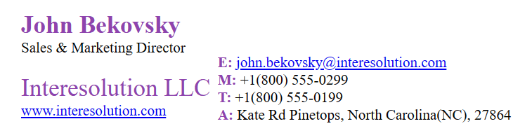
Name, title, company, phone. Nothing else. It never breaks, loads instantly, and passes every spam filter. Best for replies deep in a thread, internal email, and anyone in legal, finance or government where restraint reads as professionalism.
2. Signature with company logo

The plain layout with a logo to the left. The logo does the branding so the text can stay minimal. This is the default most companies should standardize on: it is recognizable, light, and works for every role.
3. Logo plus call-to-action banner
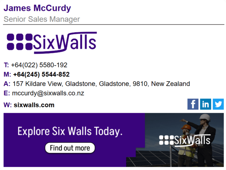
Adds a banner under the contact block: a webinar, a case study, a product launch. Banners turn every outbound email into a small ad, and they are the one element marketing should control centrally so campaigns can be swapped without asking each person to edit their settings. Keep the banner under 600 px wide and link it to a tracked URL. See the banner guide for sizes and examples.
4. Signature with a headshot
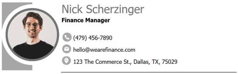
A photo instead of a logo. Suits sales, account management, recruiting, consulting, anywhere the relationship is with a person rather than a brand. Use the same crop, background and size for everyone on the team or the inconsistency is the first thing people notice.
5. Headshot with full contact block
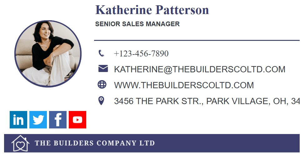
The same idea with phone, website and a booking link. This is the layout for people who need to be reached: support leads, sales reps, partnership managers. The booking link does more work than the phone number for most B2B roles.
6. Signature with social media icons

Contact block plus a row of icons. Pick the two or three networks where the company is active. Icons for dormant accounts send people to a dead page. Use the company’s accounts, not personal ones, unless the person’s own profile is part of their job (founders, recruiters, creators).
7. Full signature
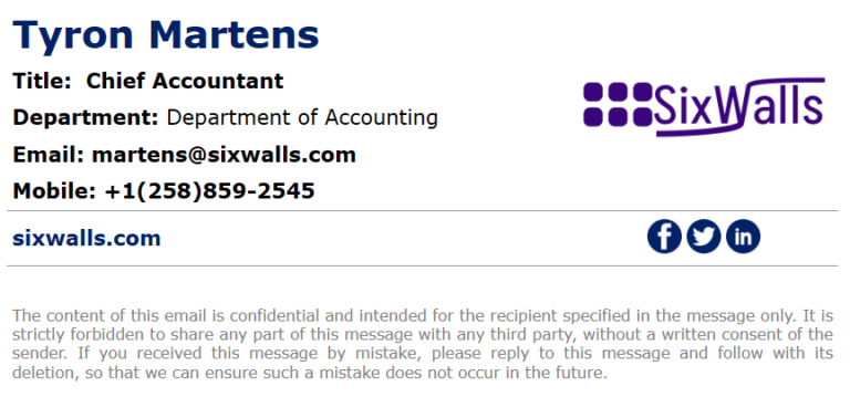
Logo, headshot, contact details, social icons and a banner. It works when every element is sized correctly and the layout is a table rather than a stack of images. It fails when someone builds it in a word processor. This layout is the reason companies move to signature management software: it is too fragile to maintain by hand across a team.
8. Signature with a legal disclaimer

A short confidentiality or regulatory notice under the signature. Required in some industries (healthcare, finance, law) and in some countries (Germany’s Impressum rules for business email, for example). Keep it to two or three lines in a smaller grey font so it does not swallow the contact details. Examples by industry are in the email disclaimer guide.
9. Signature with a video link
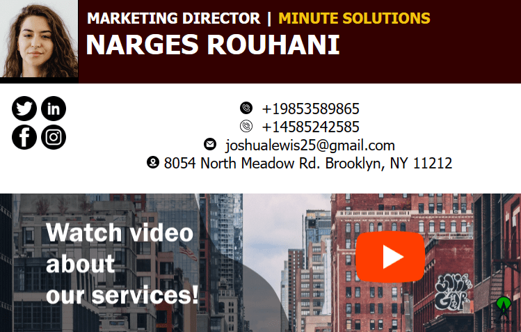
A thumbnail with a play button that links to a product demo or intro video. Email clients cannot play video inline, so the image is a link, not an embed. Good for sales and customer success teams with a demo worth watching.
10. Signature with an animated banner
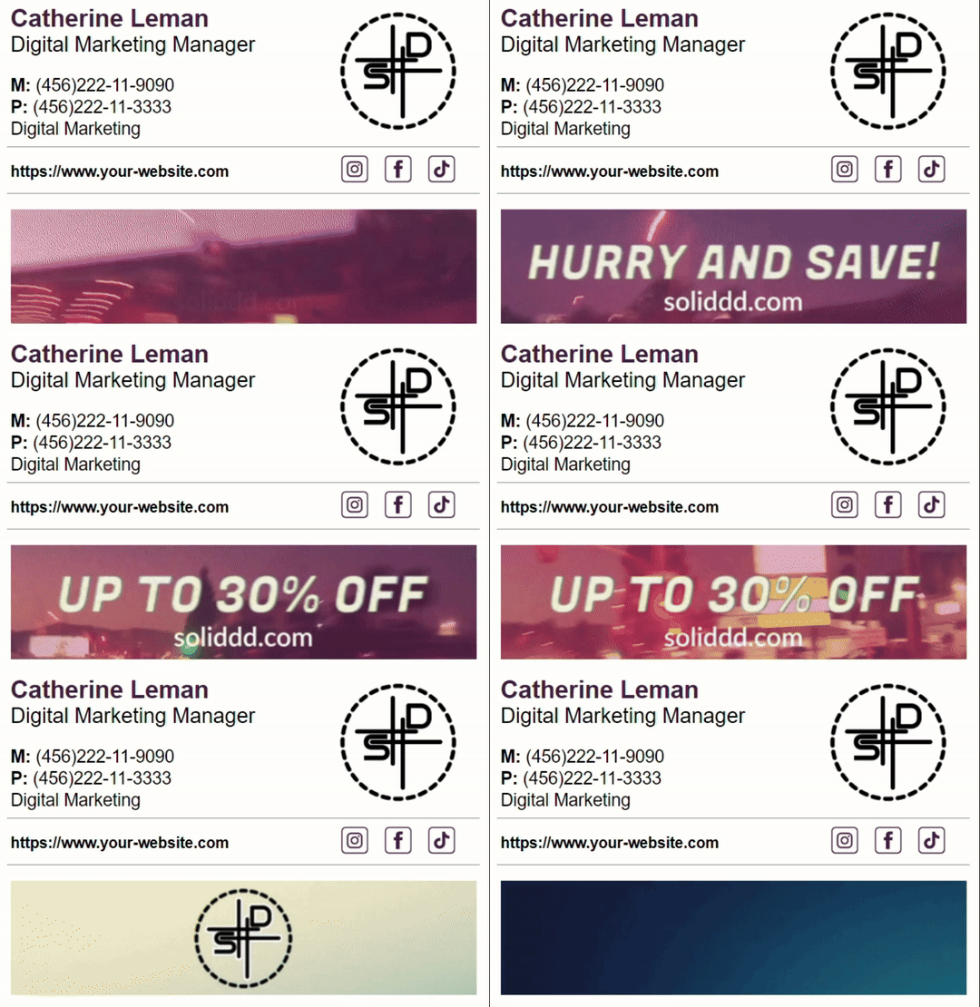
A GIF banner that cycles through two or three frames. It draws the eye in a way static banners do not. Keep it under 1 MB, make the first frame readable on its own because Outlook desktop shows only the first frame, and limit it to marketing or event-driven campaigns rather than permanent use.
How to create a professional email signature
Step 1: Decide which layout you are standardizing on
Pick one of the ten above for the whole company, with at most two variants (for example, logo-only for most roles and headshot for client-facing roles). Mixed layouts across a team look careless to anyone who emails more than one of you.
Step 2: Write the content
Full name as it appears in the directory, exact job title, company name, one phone number or booking link, website. Decide on a disclaimer with legal. Decide on social icons with marketing. Decide on pronouns as a policy, not per person.
Step 3: Prepare the images
- Logo: PNG or SVG with a transparent background, 150 to 300 px wide, under 50 KB.
- Headshot: square, 80 to 120 px, same crop for everyone, under 50 KB.
- Banner: 500 to 600 px wide, 100 to 150 px tall, under 100 KB (GIFs under 1 MB).
- Host every image on a public URL. Images pasted directly into Gmail or Outlook settings often arrive as attachments or broken boxes.
Full size and layout rules are in the email signature size and layout guide, and the best fonts for email signatures covers typefaces that render everywhere.
Step 4: Build it as an HTML table
Email clients do not reliably support CSS layout, so a professional signature is an HTML table with inline styles: one row, logo cell on the left, text cell on the right. Google Docs and Word can produce something that looks right in the editor and falls apart in Outlook. Use a signature template or have one person build the HTML once and share it.
Step 5: Add it to your email client
- Gmail: Settings → See all settings → General → Signature → Create new. Paste the signature, set it as default for new emails and replies. Google’s steps are in Create a Gmail signature.
- Outlook: Settings → Mail → Compose and reply → Email signatures (new Outlook and web), or File → Options → Mail → Signatures (classic desktop). Microsoft’s steps are in Create and add an email signature in Outlook.
- Mobile: the Gmail and Outlook mobile apps keep their own signature settings. Set them separately or they default to “Sent from my iPhone”.
Step 6: Test it
Send a test to a Gmail account, an Outlook account and your phone. Check that images load, links work, the layout holds on a narrow screen, and the signature is not duplicated on replies.
Design rules that keep a signature professional
- Four to six lines. If it is longer than the email, cut it.
- One font, two sizes. Name slightly larger; everything else 12 to 14 px. Stick to fonts installed everywhere: Arial, Helvetica, Georgia, Verdana, Calibri.
- One brand color for the name or title, dark grey for the rest. Never more than two colors.
- Separators, not line breaks, for contact details on one line:
+1 415 555 0100 | northwind.example. - Text, not images, for the text. An all-image signature is unreadable with images off, invisible to screen readers, and lands in spam more often.
- No quotes. Inspirational lines date quickly and say nothing about the company.
- Mobile first. Most business email is read on a phone. Everything above is in service of a 320 px screen.
Trends change at the margin (dark-mode-safe logos, pronoun lines, booking links replacing phone numbers); the design trends post tracks those. The rules above do not change.
Common mistakes
Every employee builds their own. The result is ten layouts, three logo versions and titles that are two promotions out of date. Nobody notices internally. Clients notice.
Images pasted instead of hosted. The signature looks fine in the sender’s client and arrives as “image001.png” attachments everywhere else.
Signature on every reply. Full signature on the first message; name and title only, or nothing, on replies in a thread. Both Gmail and Outlook can be set to do this.
Sign-off inside the signature. “Best regards,” belongs in the email body, chosen per message. Baking it into the signature means every reply ends with two closings. The guide to email sign-offs covers which to use when.
Disclaimer longer than the email. Three lines, small grey font, or move it to a linked policy page.
Stale banners. The webinar was in March. It is now October. Banners need an owner and an expiry date.
Manual signatures vs. managed signatures
| Each person sets their own | Managed centrally | |
|---|---|---|
| Setup | Everyone follows a guide, with mixed results | Admin applies one template to the directory |
| Consistency | Drifts within weeks | Identical for everyone, by design |
| Title or phone changes | Person must remember to edit | Pulled from Google Workspace or Microsoft 365 directory automatically |
| Banners and campaigns | Email everyone, hope they update | Marketing schedules them centrally, tracks clicks |
| Disclaimers | Optional in practice | Enforced per department or region |
| New hires and leavers | Part of onboarding, often missed | Applied on day one, removed on exit |
| Works for | Individuals, teams under ten | Any company that cares how it looks externally |
Native Gmail and Outlook settings are per user. Google Workspace admins can append a footer to every outgoing message from the Admin console, but it is the same text for everyone in an organizational unit and cannot be personalized with each sender’s name or title (Google Workspace Admin Help). Microsoft 365 has the equivalent in Exchange mail flow rules, with similar limits. For company-wide, per-person signatures, you need either scripts against the Gmail or Graph APIs or a signature management tool.
How BulkSignature handles this
BulkSignature is built for the “managed centrally” column. An admin installs it from the Google Workspace Marketplace or Microsoft AppSource, picks or designs a template, and assigns it by department, organizational unit, group or individual. Names, titles and phone numbers come from the directory and refresh automatically, so a promotion updates the signature without anyone editing anything. Marketing runs banner campaigns and sees click-through rates; legal sets disclaimers per region; HR gets new-hire signatures on day one. The sign-off stays out of the template, so each person still closes their emails their own way.
If you want to see what the finished layouts look like before committing, the professional email signature templates library has the ten styles above ready to customize.
Checklist before rolling out
- One layout (or two variants) chosen for the whole company
- Name, title, company, one contact method, website
- Logo and headshot sized and hosted, under 50 KB each
- Banner, if any, has an owner and an end date
- Disclaimer approved by legal, three lines maximum
- HTML table, inline styles, one font, two colors maximum
- Tested in Gmail, Outlook and on a phone
- Replies show a short version, not the full block
- A process for updating titles when people change roles
Frequently asked questions
What should a professional email signature include? Full name, job title, company, one direct contact method (phone or booking link) and website, in four to six lines. Add a logo or headshot, up to three social icons, and a disclaimer only if your industry requires one.
Should I use a photo or a logo in my email signature? Logo for most roles; headshot for client-facing roles where the relationship is personal (sales, account management, recruiting). If the whole company uses headshots, standardize the crop and size.
How big should an email signature be? Four to six lines of text, total width 320 to 600 px, images under 50 KB each and the whole signature under 100 KB. Anything larger risks clipping in Gmail and rendering badly on mobile.
Can I use a GIF in my email signature? Yes, for banners. Keep it under 1 MB and make the first frame readable on its own, because Outlook desktop displays only the first frame.
How do I make everyone’s signature the same across the company? Either write a guide and hope, use a Google Workspace or Microsoft 365 footer rule (same text for everyone, no personalization), or use signature management software that applies one template to the directory and keeps it updated.
Is an email signature the same as a sign-off? No. The sign-off is the closing phrase (“Best regards,”) you choose per email. The signature is the fixed block of contact details underneath it. Keep the sign-off out of the signature template.
Start with a layout, not a blank page
Pick the example closest to how your company presents itself, apply the specs above, and test it on a phone before anyone else uses it. If you are setting this up for more than a handful of people, start from the professional email signature templates or get started for free and deploy one signature across Google Workspace or Microsoft 365 from a single place.


