
You created your email signature yourself, and you know it looks sleek on your MacBook.
But when a colleague opens the same email in Outlook on Windows, you’re surprised to see a completely different font with weird spacing. Suddenly, that polished design doesn’t feel so polished anymore.
You know you’ve got to fix it… But how?
To help you choose your next email signature font wisely, we’re covering everything you need to know about the best fonts for email signatures, including how different platforms handle typography, which web safe fonts display reliably across devices, and how to optimize readability for both desktop and mobile.
When Fonts Fail: The Rendering Problem Most Teams Ignore
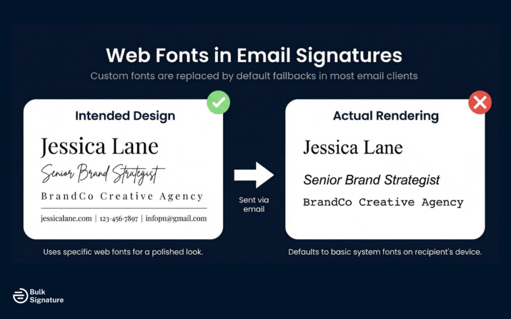
Unlike web browsers, which can load custom fonts from external sources, email clients have limited font support.
So when you create emails using a font that’s not installed on the recipient’s device, the email client will substitute it with a fallback font. This can dramatically change the appearance of your signature and undermine your carefully crafted email signature design.
The challenge is that not all fonts are available on all operating systems. A font that looks perfect on your Mac might not exist on a Windows computer, and vice versa. Mobile devices add another layer of complexity, as they often have different font libraries than desktop systems. This is why choosing email-safe fonts is critical for maintaining brand consistency and readability across all platforms.
Web Fonts Explained
Email clients support a limited set of fonts compared to web browsers. While web browsers can load custom fonts from external sources using technologies like Google Fonts, most email clients don’t support this functionality for security reasons. This means that if you use a custom font or a font that’s not widely installed, the email client will substitute it with a default font, which can dramatically change your signature’s appearance.
The safest approach is to stick to web-safe fonts that are universally available. The fonts listed in this guide are all widely supported across major email providers and operating systems, making them reliable choices for email signatures.
Top Font Choices for Email Signatures
When choosing web-safe fonts for email signatures, you want options that are professional, legible, and widely supported.
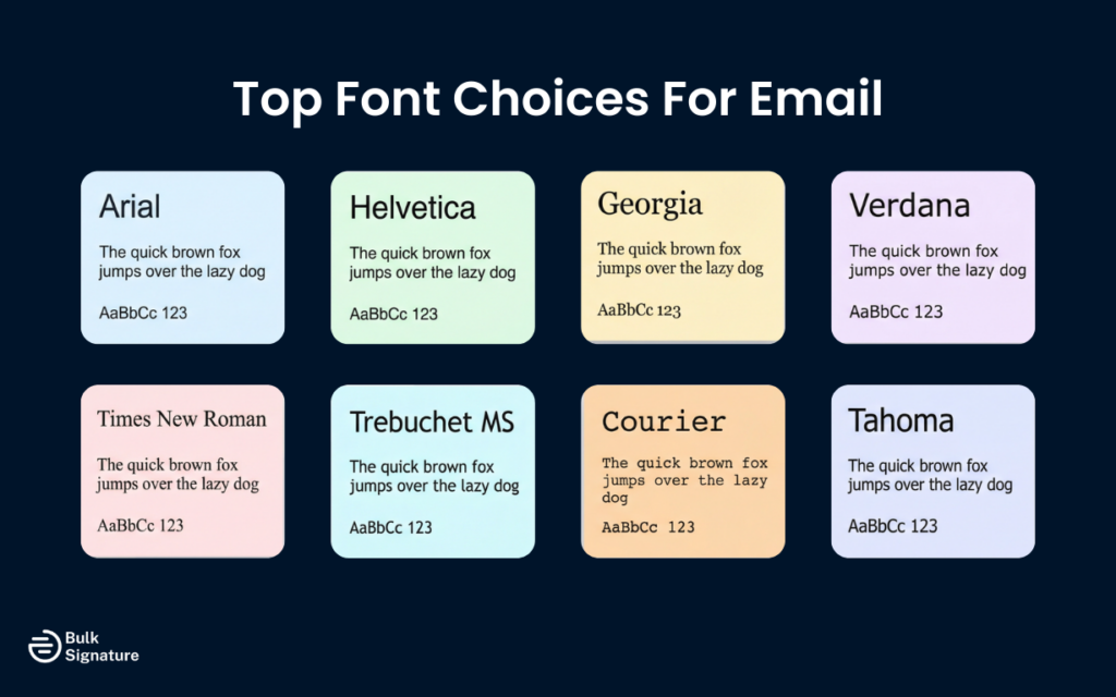
Here are the best fonts for email signatures that meet all these criteria.
Arial
Arial is one of the most popular fonts for business communication and a top choice for email signatures. This sans-serif font is clean, modern, and highly legible on both desktop and mobile devices. Arial is installed on virtually all operating systems, making it one of the most reliable web-safe fonts available.
Arial works particularly well for contact data and body text in email signatures. Its simple, straightforward design ensures readability even at smaller font sizes, and it pairs well with most design elements.
Best for: Corporate teams, sales departments, and large organizations that need universal compatibility, high readability on mobile, and consistent rendering across Gmail, Outlook, and Apple Mail.
Helvetica
Helvetica is another classic sans-serif font widely used in professional settings. It’s clean, modern, and highly legible, making it a strong choice for email signatures. Helvetica is the default font on many Apple devices, so it displays beautifully in Apple Mail and across iPhones and iPads.
However, Helvetica isn’t always available on Windows systems, where Arial is typically used as a substitute. If you choose Helvetica, specify Arial as your fallback font to maintain consistency across operating systems.
Best for: Apple-centric teams, design-conscious brands, and companies that want a polished, modern aesthetic with strong readability.
Georgia
Georgia is a serif font designed specifically for screen readability. Unlike many serif fonts that can look cluttered digitally, Georgia features larger letterforms and generous spacing that improve clarity on screens. It’s an excellent option if you prefer a more traditional or refined appearance.
Georgia is widely supported across email clients and operating systems, making it a dependable web safe choice. It works especially well for names and job titles where a slightly formal tone fits the brand.
Best for: Law firms, consulting firms, finance teams, and brands that want a classic, credible tone without sacrificing screen readability.
Verdana
Verdana was designed specifically for screen display. With wide letter spacing and a large x-height, it remains highly legible even at smaller font sizes. That makes it particularly effective for contact details and body text in email signatures.
It’s broadly supported across major email platforms and operating systems, and it performs especially well on mobile devices.
Best for: Mobile-first teams, high-volume communicators, and organizations prioritizing maximum readability across devices.
Times New Roman
Times New Roman is a long-standing serif font associated with tradition and formality. While it doesn’t feel as modern as sans serif options, it remains universally recognized and widely supported across devices and email clients.
Serif fonts can be slightly harder to read on smaller screens, so font size and spacing matter when using Times New Roman in a signature.
Best for: Legal, academic, and financial institutions that value convention and a formal brand presentation.
Trebuchet MS
Trebuchet MS offers a modern, slightly more personable alternative to Arial and Helvetica. It’s clean and professional while feeling less rigid, which can soften a brand’s tone without compromising clarity.
Although widely supported, it’s slightly less universal than Arial, so including a fallback font is recommended.
Best for: Creative agencies, startups, marketing teams, and brands that want professionalism without feeling too corporate.
Courier
Courier is a monospaced font where each character occupies the same horizontal space, giving it a distinctive typewriter-style appearance. It’s highly legible and broadly supported, but its strong personality makes it a deliberate stylistic choice.
Because of its unique look, Courier should align clearly with your brand identity before adoption.
Best for: Tech companies, developers, engineering teams, or brands with a retro or minimalist aesthetic.
Tahoma
Tahoma is a clean sans-serif font similar to Verdana but more condensed. It maintains strong readability while taking up slightly less horizontal space, which can be useful in compact signature layouts.
It’s widely supported across Windows systems and major email clients, making it a reliable choice for professional communication.
Best for: Teams that need a space-efficient, highly legible font for structured, information-dense email signatures.
Font Size and Readability Considerations
Choosing the right font is only part of the equation. Font size is equally important for making sure your email signature is legible and accessible for all audiences.
Here are a few best practices to bear in mind:
- Use 10–12pt for body text and contact details: This range keeps information readable on both desktop and mobile without making your signature feel oversized.
- Increase your name to 14–16pt: A slightly larger size creates visual hierarchy and helps your name stand out as the focal point.
- Design with mobile in mind: Text that looks perfect on a desktop monitor can feel cramped on a smartphone. Always preview your signature on multiple devices.
- Adjust for serif fonts: Fonts with smaller letterforms (such as Times New Roman) may require a slightly larger size to maintain clarity.
- Pay attention to line spacing: Adequate spacing between lines prevents your signature from looking cluttered. If default spacing feels tight, adjust it for better readability.
Pro Tip: Always check for readability by testing your signature across Gmail, Outlook, and mobile devices before rolling it out company-wide.
Looking for more advice on how to make your email signature easier to read? Read this: Email Signature Size and Layout Tips
Font Pairing and Design Best Practices
While it’s possible to use multiple fonts in your email signature, it’s generally best to stick to one or two fonts at most. Using too many different fonts can make your signature look cluttered and unprofessional.
If you do use two fonts, make sure they complement each other. A common approach is to use one font for your name and job title and another for your contact information. For example, you might use Georgia for your name to create a slightly more formal look, and Arial for your contact details for maximum readability.
Below is a cohesive reference table that brings together pairing strategy, readability standards, technical safeguards, and visual best practices.
Professional Email Signature Design Best Practices: Quick Reference Table
Best Practice | Why It Matters | How to Implement |
Limit font variety | Prevents clutter and maintains a cohesive look | Use no more than 1–2 fonts in your signature |
Pair fonts intentionally | Creates hierarchy without sacrificing readability | Use one font for name/title and another for contact details |
Use web-safe fonts | Maintains consistent display across devices | Choose widely supported fonts like Arial, Georgia, Verdana, Tahoma |
Specify fallback fonts | Protects against rendering issues | Use font-family: Helvetica, Arial, sans-serif; in HTML |
Avoid overly fancy fonts or decorative fonts | Preserves professionalism and clarity | Skip script, handwriting, Comic Sans, Papyrus, or novelty fonts |
Use appropriate font sizes | Improves readability on desktop and mobile | 14–16pt for names, 10–12pt for body text |
Optimize for dark mode | Supports readability in light and dark themes | Use high-contrast colors; avoid light gray text |
Maintain strong color contrast | Prevents eye strain and accessibility issues | Use dark text on light backgrounds when possible |
Test across platforms | Identifies rendering inconsistencies | Send test emails in Gmail, Outlook, and Apple Mail on desktop and mobile |
When in doubt, prioritize clarity over creativity. Email signatures function best when typography supports your brand without distracting from it.
More best practices on email signature design here:
Protect Your Company-Wide Email Signature
Choosing the right fonts for your email signature is all about finding the right balance between aesthetics and functionality.
While it’s tempting to use unique or decorative fonts to make your signature stand out, the most important factors are:
- Readability
- Professionalism
- Consistent display across all email clients and devices
Sticking with web-safe fonts like Arial, Georgia, Verdana, Tahoma, or properly configured Helvetica fallbacks keeps your signature readable and consistent across devices. Pair that with correct sizing (14–16pt for names, 10–12pt for contact details), strong contrast, and mobile testing, and you dramatically reduce the risk of rendering issues.
Looking to lock down your company’s typography and eliminate signature inconsistencies for good?

Tools like BulkSignature let you standardize fonts, sizing, and layouts across every inbox from a single dashboard.
Want to see how it works? Book your free BulkSignature demo today.
Frequently Asked Questions About Email Signature Fonts
What are the best email fonts for a professional signature?
The best email fonts are web-safe fonts that display consistently across Gmail, Outlook, Apple Mail, and mobile devices. Popular options include Arial, Helvetica, Verdana, Georgia, and Tahoma. These fonts are widely installed across operating systems, which reduces the risk of unwanted substitutions and formatting issues.
What font style should I use in a business email signature?
For a business email signature, a clean sans-serif font style is typically the safest choice. Sans-serif fonts like Arial or Verdana are highly legible on screens and perform well at smaller sizes. Serif fonts such as Georgia can work in more traditional industries, but readability on mobile should always be tested before rollout.
Can I use my brand’s preferred font in my email signature?
You can reference your brand’s preferred font. However, email clients do not reliably support custom or web-hosted fonts. That means if the recipient doesn’t have that font installed, their email platform will replace it. If brand consistency is critical, use a similar web-safe font and specify fallback options in your font-family.


